
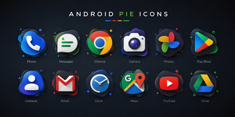
Android pie icons remain a recognizable part of Android’s visual history, especially for users interested in the design language introduced around Android 9 Pie. The icons were more than decorative elements: they helped users understand apps, notifications, system status, and actions at a glance. Android 9 Pie focused heavily on simplicity, smarter interactions, and a cleaner interface.
For designers and Android enthusiasts, understanding these icons is useful because it explains how Android moved toward adaptive, flexible, and more consistent visual experiences. It also helps when recreating an older Android interface, designing an app inspired by Pie, or simply identifying what different symbols mean.
What Are Android Pie Icons?
These graphics include launcher icons, notification symbols, status bar indicators, navigation controls, and in-app graphics. These include launcher icons, notification icons, status bar symbols, navigation controls, and icons used inside applications.
Android Pie was released as Android 9, officially corresponding to API level 28. Its interface continued the evolution toward simpler visual elements and more responsive interactions. Google also expanded notification functionality in Pie, making notification-related icons increasingly important to the everyday Android experience.
It is worth making one distinction: adaptive launcher icons were introduced with Android 8.0, not Android Pie itself. Android 9 continued using this system, allowing launcher icons to behave consistently while supporting different device shapes and masks.
Android Pie Status Bar Icons
Status bar icons provide quick information without requiring users to open an app. Depending on the device and software configuration, they can indicate network connectivity, battery condition, alarms, Bluetooth connections, notifications, and other system states.
Android’s compatibility requirements also addressed how system status icons should appear, including the use of white icons in standard situations and darker icons when a light status bar was requested.
Because manufacturers can customize parts of Android, the exact appearance of an icon may differ between phones. The meaning can also change according to the device, active settings, or context.
Android Pie Icons and Adaptive App Design
One of the most important concepts behind Android Pie’s app icon experience is adaptive icon design. Rather than forcing every phone to display exactly the same outer icon shape, Android allows the device launcher to apply its own mask.
An adaptive icon can contain separate foreground and background layers. The launcher then renders those layers according to the device’s supported shape. A phone might show a circular icon, while another device could use a rounded-square or squircle treatment.
This approach solved a common design problem. Developers could create one adaptive icon while Android and the device manufacturer handled the final presentation.
Why Adaptive Icons Matter
Adaptive icons are useful because they make app collections look more cohesive. Instead of having one square icon next to a circle and another irregularly cropped image, the launcher can apply a consistent mask.
The system can also use adaptive icons in locations beyond the home screen, including shortcuts, Settings, sharing interfaces, and overview screens.
For anyone recreating an Android Pie-style interface today, adaptive icons are therefore more important than simply collecting old PNG images.
Understanding Android Pie Notification and System Icons
Notification icons are another important category. When an application sends a notification, an icon can appear in the status bar and signal that something requires attention. Android’s current design documentation still describes the status bar as an area containing notification and system icons.
Android 9 also introduced significant notification improvements. Messaging notifications gained richer functionality, including support for images, conversations, participants, and suggested replies.
This made notification iconography part of a larger communication system rather than an isolated visual element.
Common Android Pie Icon Categories
Although individual devices may use different artwork, Android Pie-era icons can generally be grouped into:
- Status icons for battery, connectivity, and device conditions.
- Notification icons that identify apps with active notifications.
- Launcher icons representing installed applications.
- Action icons used for functions such as search, share, edit, delete, and navigation.
- Settings icons representing system features and configuration areas.
Knowing the category makes troubleshooting easier. A launcher icon, for example, should not be treated the same way as a small notification symbol.
How to Create Android Pie-Style Icons
If you want to reproduce the visual character of Android Pie, start with simplicity. Avoid squeezing too many details into a small icon. Strong silhouettes, balanced spacing, and clear visual hierarchy generally work better at small sizes.
Android Studio includes Image Asset Studio, which can generate adaptive launcher icons and notification assets. Developers can select launcher icon options, create foreground and background layers, and preview how an icon may look in different shapes.
Vector assets are particularly useful for scalable interface graphics. Android’s documentation also recommends appropriate built-in padding for small icons so that assets maintain consistent sizing and touch-target behavior.
Practical Android Pie Icon Design Tips
Keep the artwork recognizable at a small size. A detailed illustration that looks impressive at 512 pixels may become an indistinguishable blob when reduced.
Use layers when creating adaptive launcher icons. Keep important parts of the artwork away from edges because the launcher mask can crop the outer portions.
For interface actions, consider established Material icon conventions rather than inventing unfamiliar symbols. Consistency helps users understand what an icon does before they tap it.
Where to Find Android Pie Icons Today
People searching for Android Pie icons usually have one of several goals: they may want icons for a launcher theme, assets for a design project, references for an Android app, or inspiration for a retro Android interface.
For development work, Google’s Android documentation is the safest starting point because it explains current icon formats, adaptive icon behavior, and Android Studio workflows. Google distinguishes launcher icons from Google Play listing icons, so developers should also avoid assuming that one asset specification works everywhere.
If you are recreating the appearance of an older phone, screenshots can be useful as visual references, but they should not replace the technical guidelines for building a functioning Android application.
Why Android Pie Icons Still Matter
Android Pie may no longer represent the newest Android interface, but its design choices helped shape the transition toward flexible icon systems and increasingly adaptive user interfaces.
It is part of an interaction system. Its shape, contrast, spacing, context, and behavior all affect how quickly a user understands the interface.
Modern Android has continued evolving this idea. Current adaptive icon guidance supports different masks and user theming, showing how the basic concept has expanded far beyond the Android Pie era.
FAQs About Android Pie Icons
What are Android Pie icons?
Android Pie icons are the visual symbols associated with Android 9 Pie, including launcher, notification, status bar, settings, and action icons. The exact appearance can vary between manufacturers and launchers.
Were adaptive icons introduced with Android Pie?
No. Adaptive launcher icons were introduced in Android 8.0 Oreo. Android Pie continued using the adaptive icon framework, which allowed launchers to apply different shapes and visual treatments to app icons.
What do Android Pie status bar icons mean?
Status bar icons provide quick information about notifications and system conditions such as connectivity, battery status, alarms, or Bluetooth. Their appearance and exact set can vary depending on the device manufacturer and software configuration.
Can I create Android Pie-style icons today?
Yes. Android Studio’s Image Asset Studio can help developers create launcher and notification icons. Adaptive icons can use foreground and background layers, while vector assets are useful for scalable interface graphics.
Are Android Pie icons still useful for modern app design?
Absolutely. They can serve as historical inspiration and demonstrate important principles such as simplicity, scalability, consistent visual language, and adaptive presentation. Modern Android has extended these ideas with additional theming capabilities.
Conclusion
Android pie icons represent an important stage in Android’s evolution toward cleaner and more adaptable visual design. From status bar symbols to adaptive launcher icons, each category had a practical role in making the interface easier to understand.
While Android has moved well beyond Pie, its approach to iconography remains useful for developers, designers, and enthusiasts. The biggest takeaway is simple: effective icons should communicate quickly, scale gracefully, and work naturally within the surrounding interface.
Stay in touch to get more updates & alerts on site techeeradar.com! Thank you